
How We Organize
We work with organizations throughout California.
We work with local organizations in three regions: Northern California, Central Valley, and Southern California. Organizations become members and they join the Tenants Together Network bla bla
How We Organize
We work with organizations throughout California.
We work with local organizations in three regions: Northern California, Central Valley, and Southern California. Organizations become members and they join the Tenants Together Network bla bla
How We Organize
We work with organizations throughout California.
We work with local organizations in three regions: Northern California, Central Valley, and Southern California. Organizations become members and they join the Tenants Together Network bla bla
Pattern Library
Basic Page Title + Subtitle
A. Inline
Inline patterns display text or other elements directly on the page. The background color of the outermost parent can be changed along with the text color on a block-by-block basis!
Inline – One Column
Optional section introduction.
Subheading
Lorem ipsum odor amet, consectetuer adipiscing elit. Nam risus sit maximus tristique, diam efficitur. Primis vitae platea laoreet lobortis luctus praesent eu. Magnis blandit donec laoreet maximus quis nulla. Eleifend duis quam non phasellus ullamcorper ex consectetur montes habitant. Netus cubilia tortor libero, pulvinar fermentum nisl scelerisque quis. Natoque potenti enim mus viverra proin etiam suspendisse urna praesent.
Lorem ipsum odor amet, consectetuer adipiscing elit. Nam risus sit maximus tristique, diam efficitur. Primis vitae platea laoreet lobortis luctus praesent eu. Magnis blandit donec laoreet maximus quis nulla. Eleifend duis quam non phasellus ullamcorper ex consectetur montes habitant. Netus cubilia tortor libero, pulvinar fermentum nisl scelerisque quis. Natoque potenti enim mus viverra proin etiam suspendisse urna praesent.
Sdfsdfdsf
Inline – Two Column
Optional section introduction.
Subheading
Lorem ipsum dolor sit amet consectetur. Viverra eget condimentum pellentesque at amet et nisi. Tristique pellentesque in aliquam vel. Risus sed sed a tincidunt. In at ut morbi amet feugiat pellentesque hac varius.
Inline – Grid (CTA)
Optional section introduction.
By changing the Column Wrapper's Layout to Grid instead of Flex, you can establish the number of columns and have block automatically wrap into multiple rows.
Lorem ipsum longer title as an example
To add or remove grid items, just select any Grid Item and delete or duplicate as needed. Lorem ipsum dolor sit amet; longer to test the layout.
Lorem ipsum
To add or remove grid items, just select any Grid Item and delete or duplicate as needed.
Lorem ipsum
To add or remove grid items, just select any Grid Item and delete or duplicate as needed. Lorem ipsum dolor sit amet; longer to test the layout.
Inline – Grid (Basic)
Optional section introduction.
By changing the Column Wrapper's Layout to Grid instead of Flex, you can establish the number of columns and have block automatically wrap into multiple rows.
Lorem ipsum longer title as an example
To add or remove grid items, just select any Grid Item and delete or duplicate as needed. Lorem ipsum dolor sit amet; longer to test the layout.
Lorem ipsum
To add or remove grid items, just select any Grid Item and delete or duplicate as needed.
Lorem ipsum
To add or remove grid items, just select any Grid Item and delete or duplicate as needed. Lorem ipsum dolor sit amet; longer to test the layout.
Inline – Two Column (Image)
Optional section introduction.
Image Set as Background (Force Equal Height)
If the image is set as the container background, be sure to set a manual height on mobile when the columns stack.
To change the layout, swap Column 1 and Column 2.
Inline – Two Column (Image + Space)
Optional section introduction.
Image Set as Background (Force Equal Height)
If the image is set as the container background, be sure to set a manual height on mobile when the columns stack.
To change the layout, swap Column 1 and Column 2.
Inline – Two Column (Image Block)
Optional section introduction.
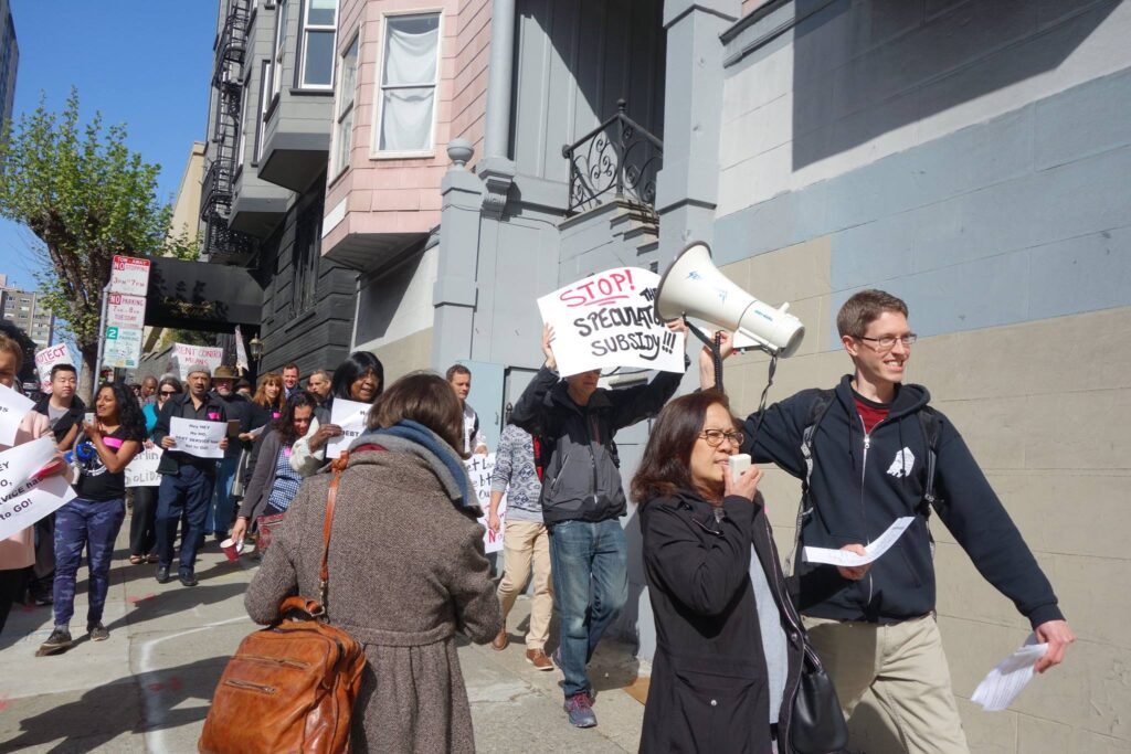
Image Inserted as Block (Inherit Height from Image)
If the image is set as the container background, be sure to set a manual height on mobile when the columns stack.
To change the layout, swap Column 1 and Column 2.
B. Boxed
Boxed patterns display text or other elements contained within an additional container, i.e. a callout box.
Boxed – One Column
Optional section introduction.
Lorem ipsum dolor sit amet consectetur
To use this or similar blocks at a narrower width, change the outermost parent container’s Content Box Width to 800px (or whatever the current theme’s Narrow width is — this may vary).
Boxed – Post Grid
Optional section introduction.
Boxed – Post Grid – Small
Optional section introduction.
Boxed – Two Column
Optional section introduction.
Lorem ipsum dolor sit amet consectetur
To change the position of text within a column, select the immediate container (ex. Column 1) > General > Layout> Justify Content > Flex Start. If this does not work, double check that your parent container settings (ex. Block Wrapper) General > Container Type > Equal Height = ON.
Boxed – Two Column Image
Optional section introduction.
Lorem ipsum dolor sit amet consectetur
Lorem ipsum odor amet, consectetuer adipiscing elit. Nam risus sit maximus tristique, diam efficitur. Primis vitae platea laoreet lobortis luctus praesent eu.
Boxed – Two Column Image – Full-Bleed
Optional section introduction. Swap order of Column 1 and Column 2 to change layout.
Lorem ipsum dolor sit amet consectetur
For full-bleed images, set the image as the background of the column container. Be sure to set a manual height on mobile when the columns stack.
Boxed – Grid (Simple)
Optional section introduction.
Lorem ipsum longer title as an example
Lorem ipsum.
Lorem ipsum
To add or remove grid items, just select any Grid Item and delete or duplicate as needed.
Lorem ipsum
To add or remove grid items, just select any Grid Item and delete or duplicate as needed.
Boxed – Grid (CTA)
Optional section introduction.
Lorem ipsum longer title as an example
Lorem ipsum
Lorem ipsum longer title as an example
Lorem ipsum
Lorem ipsum longer title as an example
Lorem ipsum
Boxed – Grid (Image CTA)
Optional section introduction.
Lorem ipsum with a longer title
To add or remove grid items, just select any Grid Item and delete or duplicate as needed.
Lorem ipsum with a longer title
To add or remove grid items, just select any Grid Item and delete or duplicate as needed.
Lorem ipsum with a longer title
To add or remove grid items, just select any Grid Item and delete or duplicate as needed.
C. Narrow
Narrow Inline – One Column
Optional Introduction
Subheading
Lorem ipsum odor amet, consectetuer adipiscing elit. Nam risus sit maximus tristique, diam efficitur. Primis vitae platea laoreet lobortis luctus praesent eu. Magnis blandit donec laoreet maximus quis nulla. Eleifend duis quam non phasellus ullamcorper ex consectetur montes habitant. Netus cubilia tortor libero, pulvinar fermentum nisl scelerisque quis. Natoque potenti enim mus viverra proin etiam suspendisse urna praesent.
Narrow Inline – Two Column
Optional section introduction.
Two-Column Block
Lorem ipsum odor amet, consectetuer adipiscing elit. Nam risus sit maximus tristique, diam efficitur. Primis vitae platea laoreet lobortis luctus praesent eu.
Lorem ipsum odor amet, consectetuer adipiscing elit. Nam risus sit maximus tristique, diam efficitur. Primis vitae platea laoreet lobortis luctus praesent eu.
Narrow Inline – Two Column (Image Block)
Optional Introduction
Image as Block
Lorem ipsum odor amet, consectetuer adipiscing elit. Nam risus sit maximus tristique, diam efficitur. Primis vitae platea laoreet lobortis luctus praesent eu.
Narrow Inline – Two Column (Image Background)
Optional Introduction
Image as Background (Columns Equal Height)
Lorem ipsum odor amet, consectetuer adipiscing elit. Nam risus sit maximus tristique, diam efficitur. Primis vitae platea laoreet lobortis luctus praesent eu.
Narrow Inline – Grid
Optional section introduction.
By changing the Column Wrapper's Layout to Grid instead of Flex, you can establish the number of columns and have block automatically wrap into multiple rows.
Lorem ipsum
To add or remove grid items, just select any Grid Item and delete or duplicate as needed.
Lorem ipsum
To add or remove grid items, just select any Grid Item and delete or duplicate as needed.
Lorem ipsum
To add or remove grid items, just select any Grid Item and delete or duplicate as needed.
Narrow Inline – Grid (CTA)
Optional section introduction.
By changing the Column Wrapper's Layout to Grid instead of Flex, you can establish the number of columns and have block automatically wrap into multiple rows.
Lorem ipsum longer title as an example
To add or remove grid items, just select any Grid Item and delete or duplicate as needed. Lorem ipsum dolor sit amet; longer to test the layout.
Lorem ipsum
To add or remove grid items, just select any Grid Item and delete or duplicate as needed.
Lorem ipsum
To add or remove grid items, just select any Grid Item and delete or duplicate as needed. Lorem ipsum dolor sit amet; longer to test the layout.
Narrow Boxed – One Column
Optional section introduction.
Optional Heading
Use this element for introductory paragraphs or callout blocks.
Narrow Boxed – Two Column
Optional section introduction.
Two-Column Block
Lorem ipsum odor amet, consectetuer adipiscing elit. Nam risus sit maximus tristique, diam efficitur. Primis vitae platea laoreet lobortis luctus praesent eu.
Narrow Boxed – Two Column (Image Block)
Optional section introduction.
Two-Column Block
Lorem ipsum odor amet, consectetuer adipiscing elit. Nam risus sit maximus tristique, diam efficitur. Primis vitae platea laoreet lobortis luctus praesent eu.
Narrow Boxed – Grid
Optional section introduction.
Lorem ipsum longer title as an example
Lorem ipsum.
Lorem ipsum
Lorem ipsum.
Lorem ipsum longer title as an example
Lorem ipsum.
Narrow Boxed – Grid (CTA)
Optional section introduction.
Lorem ipsum longer title as an example
Lorem ipsum
Lorem ipsum longer title as an example
Lorem ipsum
Lorem ipsum longer title as an example
Lorem ipsum